[ 2025 ]
VeinHealth
AI photo-monitoring for chronic venous disease — designed around the mental models of undiagnosed patients, not the clinical instrument behind them.

[ scroll to discover ]
[ research ]
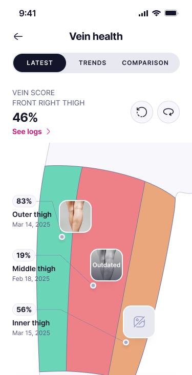
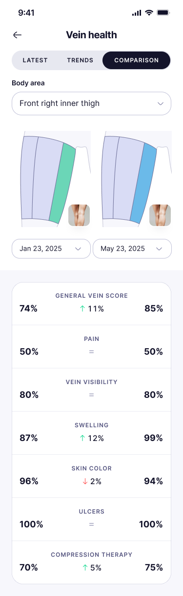
Uncovered core mental-model failures across 6 key flows through 8 moderated usability sessions—and shipped targeted fixes. For instance, 3 of 4 users mistook the vein health score for a completion progress bar; changing the display from “%” to “/100” immediately resolved the confusion.
- Sole Product Designer
- 3 months
- Mobile · iOS / Android
- Shipped




[ context & stakes ]
A stigmatized, under-diagnosed condition that demands trust on first open.
The Condition: Chronic venous disease (CVD) requires ongoing leg-monitoring, but stigma and low awareness leave many patients undiagnosed—often visiting 5–6 GPs before receiving proper care.
The UX Challenge: Photo-based leg tracking demands high trust and immediate safety for users who are often health-illiterate and sensitive about their condition.
The Goal: Build an intuitive, privacy-first experience for 3,187 launch-month active users that turns photo tracking into a safe, reliable monthly habit.
[ constraints ]
Trust and clarity were the UX.
[ what i delivered ]
Score UI
Vein-health score model, detail / trends / comparison pages.
Selector
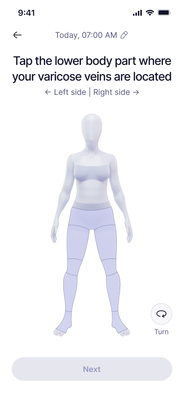
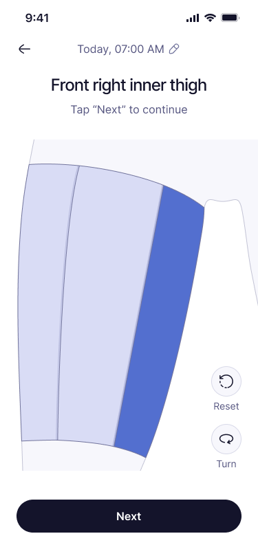
3D body-part selector for choosing the region to scan. Made with Rive app.
Reminders
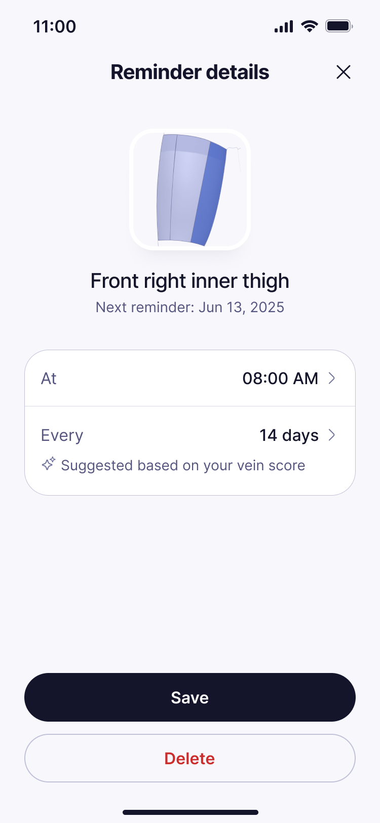
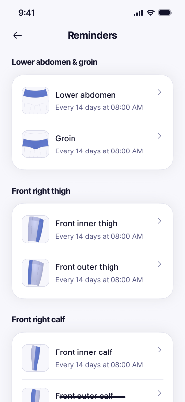
Severity-tiered reminders + hydration-tracking integration.
[ reframe from insights ]
Users weren't failing the visual design—they were building the wrong mental model.
For instance, seeing "80%" read as "questionnaire 80% complete" rather than "vein health score: 80." Recognizing this shifted the entire iteration priority from aesthetic polish to raw legibility and comprehension.
[ key decisions ][ input clarity ]
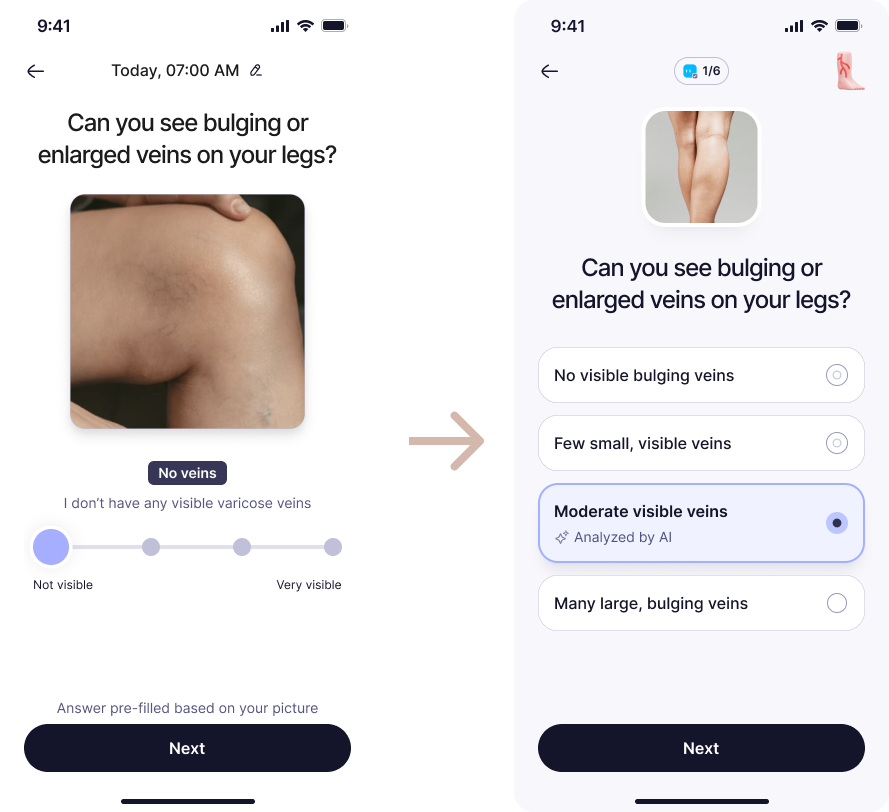
Replace sliders with explicit choices.
Chose
Replaced sliders with explicit radio button and list-based inputs.
Rationale
In a low-literacy, high-stakes medical interface, recognition beats recall—clearly visible options eliminate the cognitive load and ambiguity of slider interactions.
[ key decisions ][ scope trade-off ]
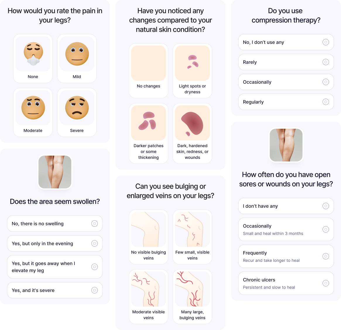
A 6-question score, reduced from the clinical VCSS.
Chose
Streamlined the instrument into a 6-question subset focusing on core indicators: veins, swelling, skin changes, ulcers, pain, and compression therapy.
Rationale
Accepting a minor trade-off in clinical granularity protects completion rates and long-term adherence—a perfectly granular score that users abandon carries zero clinical value.
[ key decisions ][ ai trust ]
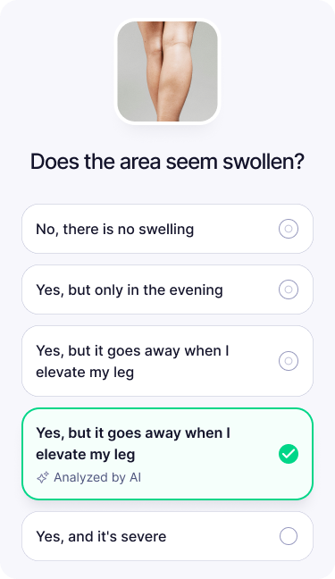
Make the AI legible and trustworthy.
Chose
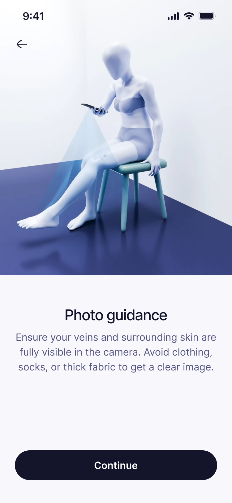
Introduced a clear green-tick confirmation state, removed the vendor attribution label, and replaced technical diagnostic output with plain-language insights.
Rationale
For a sensitive condition, the AI has to read as a helpful assistant confirming your scan — not as a data harvester or a judge of your photography.
[ key decisions ][ adherence ]
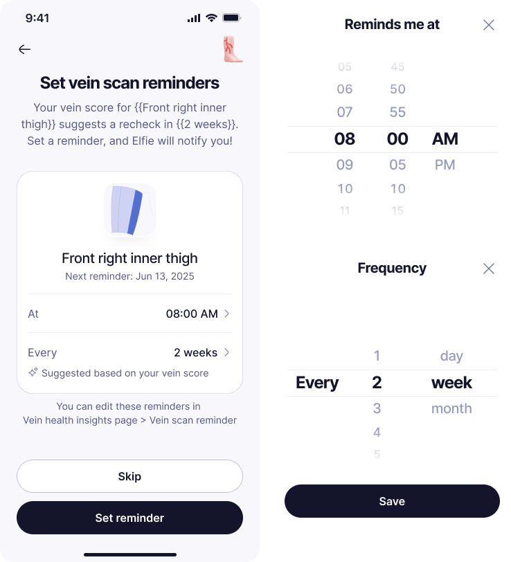
Adaptive reminders: calibrated to risk, not notification fatigue.
Chose
Implemented a tiered reminder system calibrated by severity level: every 3 months for mild cases, every 4 weeks for moderate, and every 2 weeks for severe.
Rationale
A proportional notification schedule maintains long-term adherence for chronic condition tracking without burning out healthy users with unnecessary alerts.
[ gallery ]
Selected final screens



[ outcome & impact ]
Testing with undiagnosed users revealed critical health literacy gaps that standard, diagnosed panels missed.
In stigmatized health domains, trust and clarity are the core UX—if users don't understand or trust a score, visual polish is irrelevant.
- Findings
-
6 flows
Every flow with a finding was addressed and shipped.
- Shipped
-
4 fixes
All four research-driven fixes live in production.
- Audience
-
3,187 MAU
Baseline audience with varicose veins at launch.
Post-launch iterations also shipped: a 2D → 3D body model, removal of the drug carousel (due to compliance), and simplified AI copy.